Virtual storefronts have become the gateway to global markets. Online retail has transformed shopping by making transactions more convenient and accessible. However, as businesses strive to navigate the digital space, the nuances of e-commerce platforms go beyond the ability to simply add items to a cart.
As soon as users land on your shop page, they should have quick access to everything they need to find what they’re looking for. Although this objective might seem simple, achieving it represents the fundamental baseline for a user-friendly experience. You don’t just want to satisfy your customers -- you want the shopping experience to blow them away.
Let’s review some general user experience (UX) insights that outline a few often-overlooked mistakes that have the potential to revive or ruin your e-commerce shop.
Critical Elements of a Positive E-Commerce Experience
When you complete an online purchase, what makes you want to buy from that virtual storefront again? Or what makes you tell someone you know about your experience? When e-commerce companies employ user-centered design, they’re making an effort to empathize with their customers and make the shopping experience as enjoyable as possible.
The following are some qualities that help to facilitate good UX for an online store.
Detailed Product Information
For most e-commerce stores, the products they sell are their bread and butter. Your product offerings are the whole reason your customer is there. They want to buy something -- ideally, something you offer. That reasoning alone should be enough to make you want to provide as much information about the offering as possible. A fully fleshed-out product listing includes:
- A unique, descriptive product name
- Clear, high-quality imagery
- Size and specifications -- with a sizing chart, if necessary
- A detailed description of features
- Pricing and available discounts
- Star ratings or reviews from past buyers
- Color and variation options
Breadcrumb Navigation
Once the user has viewed all the information available about the product, they may decide it’s not quite what they’re looking for. They’re often willing to continue exploring the site and browse other product options. When they hit the “back” button, they should be able to pick up their shopping right where they left off. That’s the essence of breadcrumb navigation: After experiencing a change of heart, users can easily find their way back.
Vigorous User Testing
Accessibility checklists are a huge blessing for any business looking to optimize its website and test a storefront's UX. Referencing any number of free checklists, such as those offered by accessiBe, can help achieve Web Content Accessibility Guidelines (WCAG) and a positive customer experience. Usability tests can also involve moderated in-person testing of the user interface (UI), user surveys, or a full-scale UX audit.
Maximum Accessibility
Vigorous user testing is essential because e-commerce websites are responsible for creating an ideal online shopping experience for as many users as possible. Having an accessible website means that virtually anyone of any ability can successfully use and navigate its pages, and the site’s content is universally legible. For example, users with sight or hearing impairments or those who speak a different language should still get the full experience of your UI and extract value from its content.
Common UX Mistakes Made by E-Commerce Companies
Conversely, when you intend to make an online purchase, what hindrances cause you to abandon your cart or seek the product elsewhere? The following oversights may at first seem trivial, but these common e-commerce mistakes have the potential to make or break your store’s UX.
Lack of Image Diversity
Potential customers need to be able to see your product in various settings to fully understand its use cases and applications. Once again, e-commerce companies should strive to present as much information about their offering as possible, giving buyers every reason to add it to their cart. Accurately represent the product with multiple images from different angles and in various contexts. Also, consider incorporating dynamic formats like videos or GIFs if feasible.
Confusing Navigation
Even if it’s someone’s first time visiting your site (perhaps especially so), the architecture and design of the page should be straightforward and simple to navigate. No one likes getting lost when looking for something specific, and their path to finding something should be smooth and predictable. For example, many sites feature a prominent search option or a chatbot to answer certain questions, helping the user along in the customer journey.
Complicated Checkout
Checkout should be at the top of the priority list for e-commerce websites looking to create a seamless UX. After all, checkout is the user's final step before converting to a purchase. For this reason, customers need to be able to easily edit cart contents, whether that means changing the size, quantity, or color of a product. They should have a frictionless checkout experience, from entering the shipping address to hitting “Place Order.”
Limited Payment Options
Offering multiple ways to pay is an excellent way to encourage conversions and an often-overlooked accessibility consideration. Ideally, e-commerce companies want to give their customers diverse payment method options, such as PayPal, Apple Pay, and Venmo, to avoid limiting their buyers to people with access to a debit or credit card.
Missing Meta Tags
To be effective, meta tags and alt text must be descriptive, not assumptive. Thoughtful naming conventions not only boost SEO but also improve a website’s accessibility. Keyword-stuffing in meta tags and using file names as alt text are not recommended.
Emerging Trends in E-Commerce UX Design
To ensure the e-commerce customer experience remains fruitful, merchants must stay current by adapting to trends and changes occurring across the industry. Three of these developing trends are:
Increasingly Strict WCAG Standards
Ever-stricter accessibility guidelines mean that today’s website developers prioritize producing content that considers everyone, regardless of cognitive or physical ability. This cultural shift illustrates that more and more websites are paying attention to the overall quality of their content and how it affects user experience.
Website hosts today must consider many accessibility factors -- yet another reason free usability checklists are such a valuable tool. Since these standards are constantly being updated, it’s vital that you stay informed on the latest criteria.
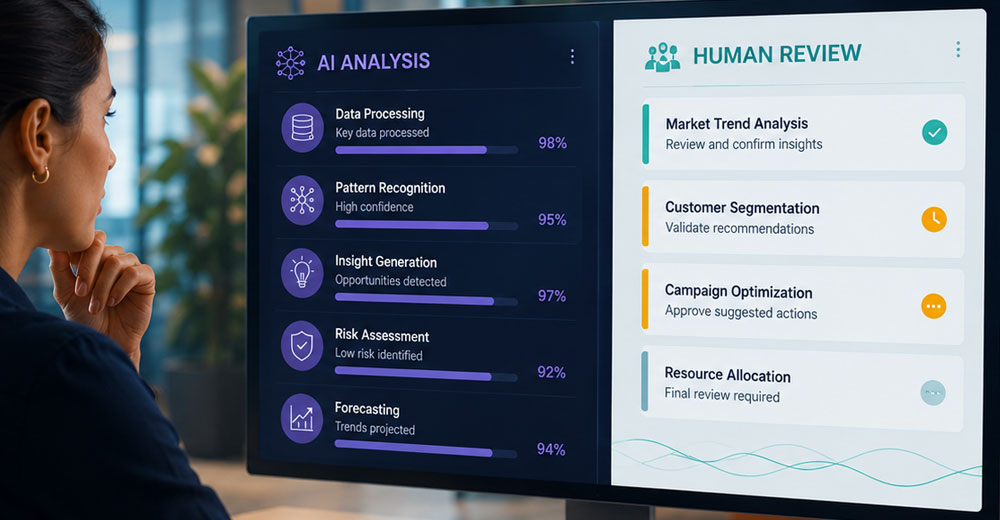
Widespread AI Adoption in E-Commerce
From chatbots to content creation, AI’s advanced automation capabilities have allowed businesses in the e-commerce industry to accomplish more in less time. New uses for AI seem to be discovered every day, particularly in sales and retail. Therefore, brands must actively research technologies that will support their bottom line and develop a detailed strategy for integrating them into their tech stack.
Marketing teams, for example, often employ AI-generated smart modules as automation tools for nurturing leads or making product recommendations. These modules show the buyer-related content they may be interested in based on specific actions they take on the site, encouraging additional conversions.
User Behavior Tracking for Lifecycle Optimization
Understanding their unique customer lifecycle in its entirety is a challenge for virtually every marketing and sales team. Optimizing this lifecycle is a matter of determining customer experiences in your industry and then using this information to promote more productive interactions with your brand, both online and in general.
You can access some of this valuable data by strategically tracking the behaviors of people who are already using your site. Modern businesses are leveraging this data to identify at what points in the lifecycle their customers experience friction. Do any of these obstacles stem from subpar UX? By observing the behaviors of your existing customer base, you can capture more value (and ideally more sales) and apply it to future updates of the entire customer lifecycle.
Bottom Line: Always Empathize With the User
When e-commerce companies and digital storefronts don’t empathize with the user, it shows. We’ve all been there: We visit an online store, but it doesn’t work how we want or expect it to. We get frustrated, and we bounce -- likely to a direct competitor. Implementing user-centered design is any virtual storefront’s best bet for avoiding that scenario, encouraging a purchase, and, best of all, delighting the customer.